Uno Platform and its Fluent app design


So, I asked myself "What do they mean when they say Fluent App Design. Over the past years of our development learning and experience we have learned so many various and different terms, from Media Queries to Responsive Web Design, and the latest Grid Templates and Flexbox (which by the way tehse two still confuses me, not that I don't know the difference between these two, I do, but seriously hacking and mastering Grids and Flexbox is like going through a nightmare, but a nightmare worth experiencing.)
Now, you reading about something called Fluent App design and you are looking like 😕. So, let's see if we can understand the concept of fluent app design. If we break down this term, we know what app design means. When I think of design, I think User Interface (UI) and User Experience (UX) design. So, when you think Fluent, and talking about developing for multi-platform (that is, Android, Windows OS, macOS, iOS, etc.) it would make sense to say fluency in developing for these different platforms.
Design Downloads
WinUI Gallery allows us to see XAML controls and the Fluent Design system in action. Click on these links to explore some of the interactive examples of the WinUI3 and WinUI2 controls, features, and functionality.
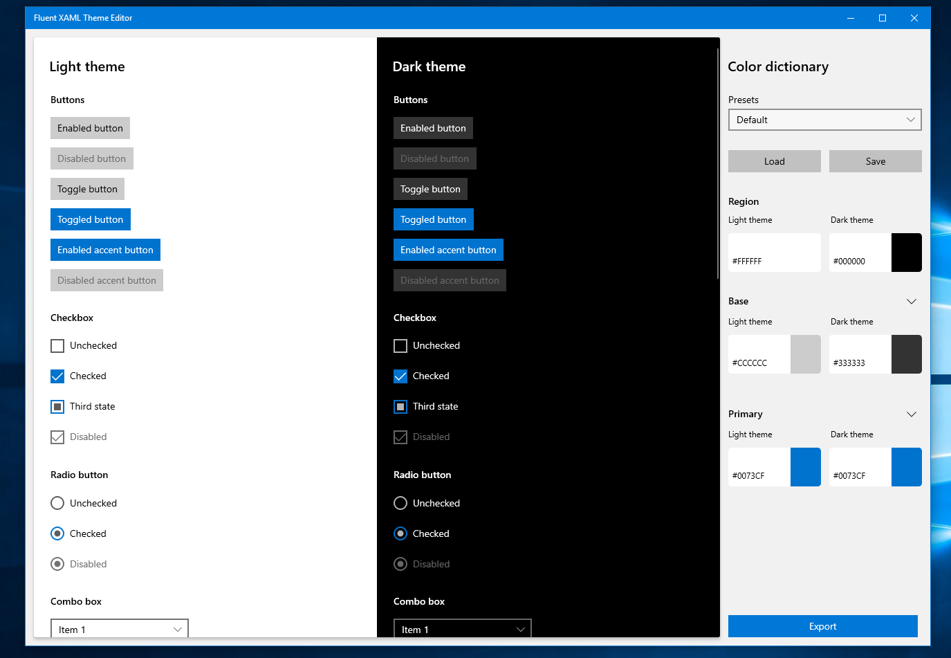
The following is an example of a tool that helps demonstrate the flexibility of the Fluent Design System along with supports for app development process by generating XAML markup.
Design basics
To learn more on how to design and build beautiful, polished apps: learn.microsoft.com/en-us/windows/apps/desi...
Here, you will learn about Navigation basics, based on a flexible model of navigation structures, navigation elements and system-level features; about Command basics, are interactive UI elements that enables the user to perform actions such as sending emails, deleting an item, or submitting a form; about Content basics, demonstrates some practical tips and examples to help in designing the content of your apps.
Layout
To learn to create flexible UIs that looks great on different screen sizes, window sizes, resolutions and orientations: learn.microsoft.com/en-us/windows/apps/desi...
Here, you will learn about screen sizes across the Windows ecosystem and how to design for breakpoints; about responsive design techniques that optimize your app's layout for breakpoints; implementing responsive UI in XAML with adaptive or tailored layouts; show independent parts of your apps in separate windows with Multiple views; use alignment, margin, and padding to influence layout behaviour; about each type of layout panel and how to use them arrange UI elements; use transforms to rotate, skew, and scale elements; about advanced layout concepts in XAML and how to create a custom virtualizing layout.
Controls and Patterns
In Windows app development, a control is a UI element that displays content or enables interaction. They are the building blocks of the user interface. While a pattern is a recipe for combining several controls to make something new.
There are three key steps to adding controls to your app:
- Add a control to your app UI,
- Set properties on the control, and
- Add code to the control's event handlers so that it does something.
You can customize the appearance of your apps in many ways by using the XAML framework. Styles lets you set control properties and reuse those settings for a consistent appearance across multiple controls.
To learn more about how to use the various controls and patterns: learn.microsoft.com/en-us/windows/apps/desi...
Style
Style: is what makes your app stand out. You do this with color, typography, and new features such as acrylic material and reveal highlight.
Color: provides intuitive wayfinding through an app's various levels of information and serves as a crucial tool for reinforcing the interaction model.
Typography: is a visual representation of language, which helps users understand content easily.
Icons: harmoize with typography and with the rest of the design language.
Acrylic: creates a sense of depth, a brush that creates stunning, translucent surfaces.
Reveal focus: is a lighting effect for 10 foot experiences, such as XBox One and television screens, and animates the border of focusable elements.
Sound: helps complete an application's user experience, and gives them that extra audio edge they need to match the feel of Windows across all platforms.
Writing style: make a big difference between an awful user experience and a better one.
To learn more and read further on about Styles: learn.microsoft.com/en-us/windows/apps/desi...
Motion
Fluent motion serves a purpose by giving intelligent feedback based on user's behavior, keeps the UI feeling alive and gives the user's navigation through your app. Fluent motion elicits an emotional connection between a user and their digital experience.
To learn on how to build on a foundation of natural movement, a good idea is to follow these Fluent motion principles:
Physical: When you interact with UI via touch, the movement of the UI is directly related to the velocity of the interaction, because this touch is direct manipulation the object you interact with affects the objects around it.
Functional: Page transitions are purpose-built, giving hints about how pages are related to each other. They move in a manner that's perceived as fast even when performance is not optimal.
Continuous: Objects can travel from scene to scene or morph within a scene to provide continuity and help the user maintain context.
Contextual: Animation should tie back to the user interaction. A context menu is deployed from a point where the user activated it.
Directionality and gravity: Directional signals help provide a solid mental model of the journey a user takes across experiences, while Directional movement is subject to forces like gravity which reinforces the natural feel of the movement.
Page transitions: navigate users between pages in an app, providing feedback about the relationship between pages.
Connected animation: lets you create a dynamic and compelling navigation experience by animating the transition of an element between two different views.
To learn more about Motions: learn.microsoft.com/en-us/windows/apps/desi...
Shell
To learn more on how to use tiles, badges, toasts, and notifications to provide entry points into your app: learn.microsoft.com/en-us/windows/apps/desi...
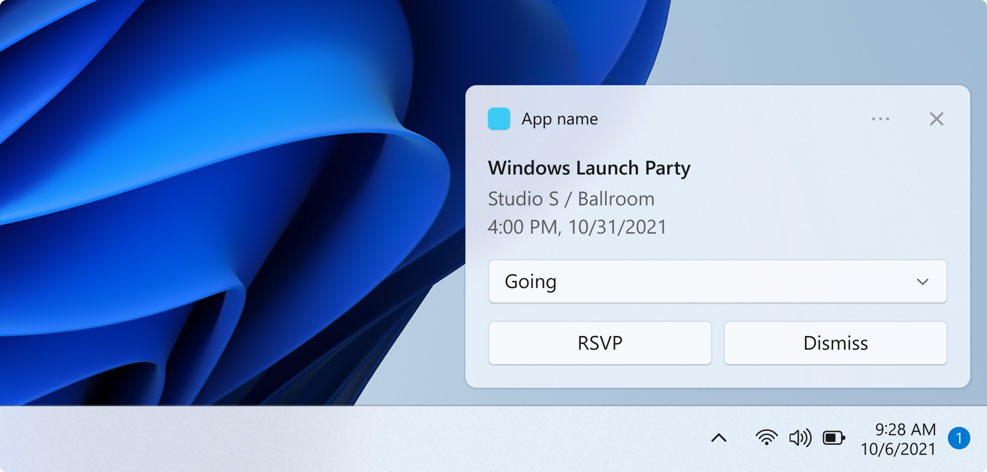
Toast notifications: adaptive and interactive; lets you create flexible notifications with text, images, and buttons/inputs.
Badge notifications: conveys summary or status information specific to your app.
Push notifications: let's third-party developers send toast, tile, badge and raw updates from their own cloud service.
Taskbar: ask your user to pin your app to the taskbar to make it easier to find.
Title bar: extend your app content into the title bar and add custom context.
Start menu icon: can pin secondary icons to provide access to specific content.
Input and Interaction
Without inputs you can't really have user interaction. To learn more about each input device type and its behaviors, capabilities, and limitations when paired with certain form factors, and how to track user's gaze based on the location and movement: learn.microsoft.com/en-us/windows/apps/desi...
Devices
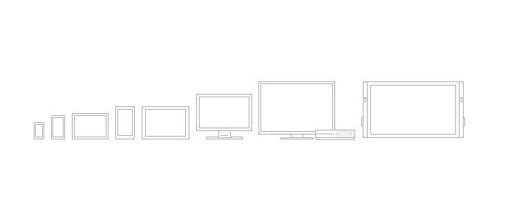
To learn more about the devices that support Windows apps that help you offer the best user experience for the various form factors: PCs and laptops; Tablets; Xbox and TV; Phones and phablets; Surface Hub; Windows IoT: learn.microsoft.com/en-us/windows/apps/desi...
Usability
To learn about making your Windows app more inclusive by adding accessibility features, enabling globalization and localization, enabling users to customize their experience, and providing help when users need it: learn.microsoft.com/en-us/windows/apps/desi...